> ## Documentation Index
> Fetch the complete documentation index at: https://docs.altoura.com/llms.txt
> Use this file to discover all available pages before exploring further.
# Adding and Customizing UI Controls in an Experience
> UI Controls are callouts in the space that can expand to more information, including text, images, videos, when the user interacts with it. This allows you to draw attention to different part of the space without being confined by the step by step panel, and encourages the user to be more interactive within the Experience.
UI Controls have two states: discover & expanded. Discover mode is when a UI Control is ready to be interacted with, represented by a colored square in the space. Expanded mode is when a UI Control is interacted with by click or tap, resulting in a pop up of text, image, video, teleport, browser, or animation.
A UI Control in an Experience can be added either from a [node](/docs/features/experience-system/node-definitions#ui-controls) or a [connector](/docs/features/experience-system/connectors/definition).

 Below you'll learn about how to create these in an Experience node.
## Adding UI Controls
At the bottom of a node or connector there is an option to add UI Controls.
Below you'll learn about how to create these in an Experience node.
## Adding UI Controls
At the bottom of a node or connector there is an option to add UI Controls.
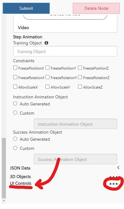 When you click the ellipses on the right, a pop up with the UI Control options will appear.
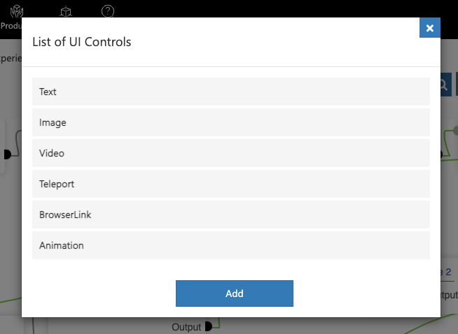 Once you choose a UI Control type, the UI Control customization will appear on the node.
 ## UI Control Base Customization
**Name** – The text value to title the UI Control in the node. This is only visible within the builder to organize and identify your UI Controls.
**UIControlIconColor** – The color of the UI Control icon in the discover view.
**UIControlTextPanelColor** – The color of the back of the UIControlText below the icon if there is a UIControlText defined.
**ViewMode** – Whether the UI Control is visible in the Dollhouse or the Realscale model.
**IsStatic** – If this is unchecked, the UI Control will scale with the distance of the user from the UI Control. If it is checked, the UI Control will be a set scale.
**Constraints** –
### This customization is not yet functional.
**WorldOrientation** – If Billboard is chosen, the UI Control in the expanded & discover view will always face the user.
**InitialSpawnGameObject** – The name of a GameObject in the asset bundle with a Transform component. The global position of this object will be the position that the discover UI Control icon will display at. The Transform Matrix below is an optional offset to the position, rotation, and scale of the InitialSpawnGameObject transform.
**UIControlText** – The text to display below the UI Control icon in the discover view. If left empty, there will be no title below the UI Control icon in the discover view.
**UIControlIcon** – The image icon of the UI Control in discover view. If left empty, a default icon related to the UI Control type will be displayed.
**UIControlVisitedIcon** – The image icon that replaces the UIControlIcon after he UI Control in discover view has been clicked. If left empty, the UIControlIcon will not change on click.
**MustInteract** – Whether or not the user must interact with the UI Control in order to move to the next step via the step by step panel next arrow.
**IsNetworked** – Whether or not the display state of the UI Control is synced with all other users if in a meeting.
## UI Control Text Type Customization
**Expanded Matrix** – The position, rotation, and scale offset from InitialSpawnGameObject position, rotation, and scale values for the expanded view.
**OnExpandAnimation** – The name of a GameObject in the asset bundle with a Playable Director or Animator component attached. This animation attached will play from the discover to expanded view.
**OnExpandActivateObjects** – The list of objects, separated by commas, to set active when changing from the discover to expanded view.
**OnExpandDeactivateObjects** – The list of objects, separated by commas, to set inactive when changing from the discover to the expanded view.
**OnCloseAnimation** – The name of a GameObject in the asset bundle with a Playable Director or Animator component attached. This animation attached will play from the expanded to discover view.
**OnCloseActivateObjects** – The list of objects, separated by commas, to set active when changing from the expanded to discover view.
**OnCloseDeactivateObjects** – The list of objects, separated by commas, to set inactive when changing from the expanded to discover view.
**TitleText** – The title of the text panel that displays in the expanded view.
**BodyText** – The body text of the text panel that displays in the expanded view.
## UI Control Image Type Customization
**Expanded Matrix** – The position, rotation, and scale offset from InitialSpawnGameObject position, rotation, and scale values for the expanded view.
**OnExpandAnimation** – The name of a GameObject in the asset bundle with a Playable Director or Animator component attached. This animation attached will play from the discover to expanded view.
**OnExpandActivateObjects** – The list of objects, separated by commas, to set active when changing from the discover to expanded view.
**OnExpandDeactivateObjects** – The list of objects, separated by commas, to set inactive when changing from the discover to the expanded view.
**OnCloseAnimation** – The name of a GameObject in the asset bundle with a Playable Director or Animator component attached. This animation attached will play from the expanded to discover view.
**OnCloseActivateObjects** – The list of objects, separated by commas, to set active when changing from the expanded to discover view.
**OnCloseDeactivateObjects** – The list of objects, separated by commas, to set inactive when changing from the expanded to discover view.
**ImageUrl** – The image that displays in the expanded view.
## UI Control Video Type Customization
**Expanded Matrix** – The position, rotation, and scale offset from InitialSpawnGameObject position, rotation, and scale values for the expanded view.
**OnExpandAnimation** – The name of a GameObject in the asset bundle with a Playable Director or Animator component attached. This animation attached will play from the discover to expanded view.
**OnExpandActivateObjects** – The list of objects, separated by commas, to set active when changing from the discover to expanded view.
**OnExpandDeactivateObjects** – The list of objects, separated by commas, to set inactive when changing from the discover to the expanded view.
**OnCloseAnimation** – The name of a GameObject in the asset bundle with a Playable Director or Animator component attached. This animation attached will play from the expanded to discover view.
**OnCloseActivateObjects** – The list of objects, separated by commas, to set active when changing from the expanded to discover view.
**OnCloseDeactivateObjects** – The list of objects, separated by commas, to set inactive when changing from the expanded to discover view.
**VideoPanel** – The video that displays in the expanded view.
## UI Control Teleport Type Customization
**TeleportGameObject** – The name of a GameObject in the asset bundle with a Transform component attached. The position on this GameObject is where the user will teleport to in the Realscale space.
**TeleportActivateObjects** – The list of objects, separated by commas, to set active on teleport.
**TeleportDeactivateObjects** – The list of objects, separated by commas, to set inactive on teleport.
## UI Control Browser Link Type Customization
**BrowserLink** – The URL to link to on expand.
## UI Control Animation Type Customization
**OnPressAnimation** – The name of a GameObject in the asset bundle with a Playable Director or Animator component attached. This animation attached will play from the expanded to discover view.
**OnPressActivateObjects** – The list of objects, separated by commas, to set active on press of the UI Control.
**OnPressDeactivateObjects** – The list of objects, separated by commas, to set inactive on press of the UI Control.
## UI Control Base Customization
**Name** – The text value to title the UI Control in the node. This is only visible within the builder to organize and identify your UI Controls.
**UIControlIconColor** – The color of the UI Control icon in the discover view.
**UIControlTextPanelColor** – The color of the back of the UIControlText below the icon if there is a UIControlText defined.
**ViewMode** – Whether the UI Control is visible in the Dollhouse or the Realscale model.
**IsStatic** – If this is unchecked, the UI Control will scale with the distance of the user from the UI Control. If it is checked, the UI Control will be a set scale.
**Constraints** –
### This customization is not yet functional.
**WorldOrientation** – If Billboard is chosen, the UI Control in the expanded & discover view will always face the user.
**InitialSpawnGameObject** – The name of a GameObject in the asset bundle with a Transform component. The global position of this object will be the position that the discover UI Control icon will display at. The Transform Matrix below is an optional offset to the position, rotation, and scale of the InitialSpawnGameObject transform.
**UIControlText** – The text to display below the UI Control icon in the discover view. If left empty, there will be no title below the UI Control icon in the discover view.
**UIControlIcon** – The image icon of the UI Control in discover view. If left empty, a default icon related to the UI Control type will be displayed.
**UIControlVisitedIcon** – The image icon that replaces the UIControlIcon after he UI Control in discover view has been clicked. If left empty, the UIControlIcon will not change on click.
**MustInteract** – Whether or not the user must interact with the UI Control in order to move to the next step via the step by step panel next arrow.
**IsNetworked** – Whether or not the display state of the UI Control is synced with all other users if in a meeting.
## UI Control Text Type Customization
**Expanded Matrix** – The position, rotation, and scale offset from InitialSpawnGameObject position, rotation, and scale values for the expanded view.
**OnExpandAnimation** – The name of a GameObject in the asset bundle with a Playable Director or Animator component attached. This animation attached will play from the discover to expanded view.
**OnExpandActivateObjects** – The list of objects, separated by commas, to set active when changing from the discover to expanded view.
**OnExpandDeactivateObjects** – The list of objects, separated by commas, to set inactive when changing from the discover to the expanded view.
**OnCloseAnimation** – The name of a GameObject in the asset bundle with a Playable Director or Animator component attached. This animation attached will play from the expanded to discover view.
**OnCloseActivateObjects** – The list of objects, separated by commas, to set active when changing from the expanded to discover view.
**OnCloseDeactivateObjects** – The list of objects, separated by commas, to set inactive when changing from the expanded to discover view.
**TitleText** – The title of the text panel that displays in the expanded view.
**BodyText** – The body text of the text panel that displays in the expanded view.
## UI Control Image Type Customization
**Expanded Matrix** – The position, rotation, and scale offset from InitialSpawnGameObject position, rotation, and scale values for the expanded view.
**OnExpandAnimation** – The name of a GameObject in the asset bundle with a Playable Director or Animator component attached. This animation attached will play from the discover to expanded view.
**OnExpandActivateObjects** – The list of objects, separated by commas, to set active when changing from the discover to expanded view.
**OnExpandDeactivateObjects** – The list of objects, separated by commas, to set inactive when changing from the discover to the expanded view.
**OnCloseAnimation** – The name of a GameObject in the asset bundle with a Playable Director or Animator component attached. This animation attached will play from the expanded to discover view.
**OnCloseActivateObjects** – The list of objects, separated by commas, to set active when changing from the expanded to discover view.
**OnCloseDeactivateObjects** – The list of objects, separated by commas, to set inactive when changing from the expanded to discover view.
**ImageUrl** – The image that displays in the expanded view.
## UI Control Video Type Customization
**Expanded Matrix** – The position, rotation, and scale offset from InitialSpawnGameObject position, rotation, and scale values for the expanded view.
**OnExpandAnimation** – The name of a GameObject in the asset bundle with a Playable Director or Animator component attached. This animation attached will play from the discover to expanded view.
**OnExpandActivateObjects** – The list of objects, separated by commas, to set active when changing from the discover to expanded view.
**OnExpandDeactivateObjects** – The list of objects, separated by commas, to set inactive when changing from the discover to the expanded view.
**OnCloseAnimation** – The name of a GameObject in the asset bundle with a Playable Director or Animator component attached. This animation attached will play from the expanded to discover view.
**OnCloseActivateObjects** – The list of objects, separated by commas, to set active when changing from the expanded to discover view.
**OnCloseDeactivateObjects** – The list of objects, separated by commas, to set inactive when changing from the expanded to discover view.
**VideoPanel** – The video that displays in the expanded view.
## UI Control Teleport Type Customization
**TeleportGameObject** – The name of a GameObject in the asset bundle with a Transform component attached. The position on this GameObject is where the user will teleport to in the Realscale space.
**TeleportActivateObjects** – The list of objects, separated by commas, to set active on teleport.
**TeleportDeactivateObjects** – The list of objects, separated by commas, to set inactive on teleport.
## UI Control Browser Link Type Customization
**BrowserLink** – The URL to link to on expand.
## UI Control Animation Type Customization
**OnPressAnimation** – The name of a GameObject in the asset bundle with a Playable Director or Animator component attached. This animation attached will play from the expanded to discover view.
**OnPressActivateObjects** – The list of objects, separated by commas, to set active on press of the UI Control.
**OnPressDeactivateObjects** – The list of objects, separated by commas, to set inactive on press of the UI Control.