
Filter Pane
The Filter Pane has three controls that lets the user filter the records that will be displayed on the right pane.- the first filter [Training Dates] helps to filter data using a date range.
- the second filter [Nodes] helps to filter based on Nodes.
- the third filter [Username] lets the user select one or more trainees.
- the fourth filter [Session Mode] helps to filter trainings based on how they were run, if it was run in Practice mode or an Assessment mode.
Data Pane
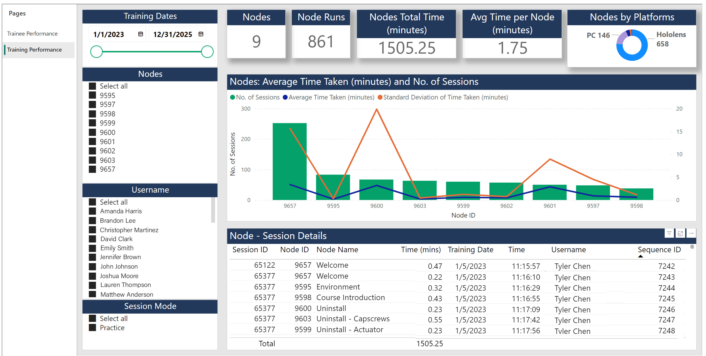
The Data Pane can be divided into three interconnected panels. Top Panel The top panel consists of cards that display summary information: a. Nodes - This card in the report displays the total number of active nodes that are present in the experience. b. Node Runs – This card displays the total number of times the node was executed as part of the various sessions that were run for the selected filters in the left pane. c. Nodes Total Time – This card displays the total time that was spent by the trainees on the execution of nodes. d. Average Time per Node – This card displays the average time taken per node. Center PanelThe Center panel helps visualize information related to every node. Here, the number of times that a particular node was executed as part of the various sessions is displayed. This pane can help understand the time taken for every node in the training and hence give an idea of the complexity of the node. By selecting an individual node, users can see in how many sessions the node was executed from the data in the bottom panel. The red line that runs across the Nodes denotes the average time taken for the execution of the node across all the sessions. The yellow line indicates the Standard Deviation of the time taken for that node.Notes:
Nodes with higher average time are the complex nodes and Nodes with a low average time are the simpler nodes. Nodes that have higher std deviation are the ones wherein there was a large variation in results. The following maybe deduced using the average time and standard deviation data:- High Avg Time + Low Std Deviation means everybody struggled on that node.
- High Avg Time + High Std Deviation means it was a complex node, but few users struggled more than the others.
- Low Avg Time + Low Std Deviation means it was a simple node and all users breezed thru that node.
- Low Avg Time + High Std Deviation means it was a simple node, but few users struggled with it.