
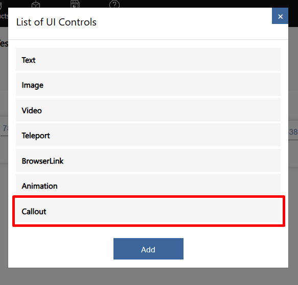
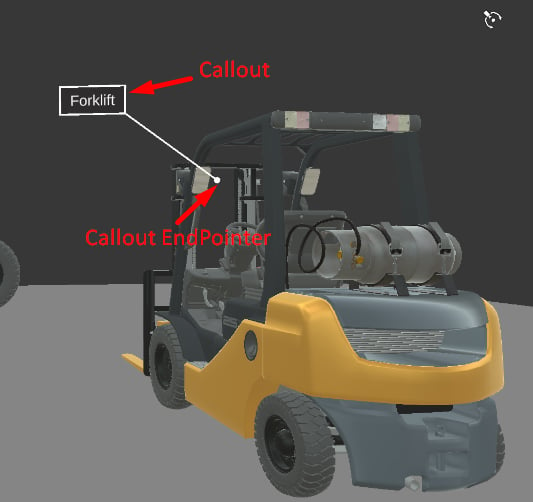
Callout Base Customization
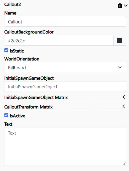
Name – Defines the title of the Callout within the builder interface. This value is only visible in the builder and is used for organizing and identifying Callouts. CalloutBackgroundColor – Specifies the background color of the Callout. IsStatic – Unchecked: The Callout will scale dynamically based on the user’s distance. Checked: The Callout will maintain a fixed scale, regardless of the user’s distance. WorldOrientation – Determines the Callout’s orientation behavior: Billboard: The Callout will always face the user. None: The Callout will follow the direction of the InitialSpawnGameObject. InitialSpawnGameObject – Defines the GameObject from the asset bundle that contains a Transform component. The global position of this GameObject will be used as the Callout’s display position. If not specified: The Callout will default to the (0,0,0) position in the space. InitialSpawnGameObject Matrix –Represents the Transform Matrix, which defines an offset for the Callout end pointer relative to the InitialSpawnGameObject position.. CalloutTransform Matrix – Represents the Transform Matrix, which defines an offset for the Callout background relative to the InitialSpawnGameObject position.